 Button Repository Editor
Overview
In the Button Repository ("Repositories Overview") you can edit the layout of buttons. Every button in your project refers to one layout in this repository by a name.In this dialog, the button repository can be edited, new button layouts can be added, and existing ones can be modified.
User Interface
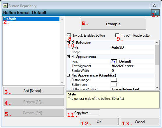
1. Open Help
Opens the help page for this dialog.2. Repository of button layouts
Lists the names of the button layouts. Click on a name to see or change the layout.3. Add [Space]...
Adds a new button layout to the button repository. A name is suggested, which you may change in a name that does not already exist.4. Re name [F2]...
Changes the name of the selected button layout. This affects all the buttons in your project that use this layout. The new name must be unique.5. Remove [Del]...
Removes the button layout from the button repository. This affects all the buttons in your project that use this layout, so take care when deleting a layout entry.6. Sample button
7. Sample Button
This button does not do anything if you click it. It is only there as a sample that allows you to test the button layout.8. Check box
If un-checked, the sample button appears as if the button is disabled. Use this to test the layout in disabled state.9. Check box
If checked, the sample button appears as if it were in toggle mode. In toggle mode, a button is permanently pressed, or released. Use this to test your button layout for buttons in toggle mode.10. Options Table
Contains a list of settings for the button layout. In the left column you may change one or more settings. Note that some of the settings offer a small button, which when pressed opens a further dialog to change the setting.Style
type: Select from the listThe general style of the button: 3D or flat
Select one of those presets:
Auto3D
If set, the button should look like 3D and automatically popup
Flat
If set, the button should be flat
Auto3D
If set, the button should look like 3D and automatically popup
Flat
If set, the button should be flat
Shape
type: See description [this value cannot be changed]The shape of the button (not yet available)
ButtonImage
type: Known image nameThe background image of the button.
This property uses the Image Repository. For more information about the use of images in a project, refer to "Image Repository"
ButtonIcon
type: Known image nameSmall image next to the text on the button. You can also specify where the icon is displayed relative to the text.
This property uses the Image Repository. For more information about the use of images in a project, refer to "Image Repository"
ButtonIconPosition
type: Select from the listSpecifies the position of the text and icon relative to each other on the button
Select one of those presets:
Overlay
ImageBeforeText
TextBeforeImage
ImageAboveText
TextAboveImage
Overlay
ImageBeforeText
TextBeforeImage
ImageAboveText
TextAboveImage
Font
type: Known text font nameThe font of the button
This property uses the Font Repository. For more information about the use of text fonts in a project, refer to "Font Repository"
TextAlignment
type: Select from the listSpecifies the alignment of the text on the button
Select one of those presets:
TopLeft
TopCenter
TopRight
MiddleLeft
MiddleCenter
MiddleRight
BottomLeft
BottomCenter
BottomRight
TopLeft
TopCenter
TopRight
MiddleLeft
MiddleCenter
MiddleRight
BottomLeft
BottomCenter
BottomRight
ForegroundColor
type: Known color nameThe color of the text on the button in normal state
This property uses the Color Repository. For more information about the use of colors in a project, refer to "Color Repository"
BackgroundColorDisabled
type: Known color nameThe background color of the button for when the button is in disabled state
This property uses the Color Repository. For more information about the use of colors in a project, refer to "Color Repository"
BackgroundColor
type: Known color nameThe background color of the button in normal state
This property uses the Color Repository. For more information about the use of colors in a project, refer to "Color Repository"
BackgroundColorPress
type: Known color nameThe background color of the button when the button is pressed
This property uses the Color Repository. For more information about the use of colors in a project, refer to "Color Repository"
BackgroundColorHover
type: Known color nameThe background color of the button when some holds his mouse pointer over it
This property uses the Color Repository. For more information about the use of colors in a project, refer to "Color Repository"
BackgroundColorToggled
type: Known color nameThe background color of the button in toggled state
This property uses the Color Repository. For more information about the use of colors in a project, refer to "Color Repository"
BorderColor
type: Known color nameThe color of the border of the button (only visible in Flat style and if BorderWidth is greater than 0)
This property uses the Color Repository. For more information about the use of colors in a project, refer to "Color Repository"
BorderColorToggled
type: Known color nameThe color of the border of the button if the button is in toggled state (only visible in Flat style and if BorderWidth is greater than 0)
This property uses the Color Repository. For more information about the use of colors in a project, refer to "Color Repository"
BorderWidth
type: Integer valueThe width of the border of a button (in pixels), which is only visible if the button style is Flat.
11. Copy from...
Opens a tool box with a list of all other buttons. Click one of the button names to copy all the properties of that button into the button you are editing. You may press the close button (little red cross) to cancel the copy.12. OK
Accepts the changes and closes the dialog.13. Cancel
Rejects the changes and closes the dialog. If button layouts have been changed, a message appears asking you if you are shure you want to cancel, because then the changed layouts are reset to the state before you started.
Details
The idea of the Button Repository is that you store the layouts for the buttons that you use in your project on a central place. The reason for that is that it is more easy to change the button layouts that you have used everywhere in your project afterwards.Each button layout will be given a name, either by Polybench or by you. It doesn't matter what name you give to it, as long as the name has a meaning to you for the button layout, and the name is unique for one button layout.
Spaces in the name are allowed. For efficiency reasons it is better not to make button names very long.
If you cancel the dialog, the changes that are made to button layouts are reset, and nothing should change for your project. However, if you change for example a color in the Color Repository Dialog, which is opened from this dialog, then changes to the color will not be reset. This is because the color repository (but also other repositories) work for themselves.