 Key Pad
Overview
This is a keyboard objects that has been designed to be used on touch-screen monitors. A number of default layouts can be selected for user text input in your app.It is possible to create custom key pads, or keys with pre-defined texts.
Properties
Find more information about changing properties here: "Properties Viewer"BackgroundColor
type: Known color nameThe background color of the key pad. Select a color from the color repository.
This property uses the Color Repository. For more information about the use of colors in a project, refer to "Color Repository"
ForegroundColor
type: Known color nameThe foreground color of the key pad. Select a color from the color repository.
This property uses the Color Repository. For more information about the use of colors in a project, refer to "Color Repository"
Font
type: Known text font nameThe font of the characters on the keys. Choose a font from the font repository.
This property uses the Font Repository. For more information about the use of text fonts in a project, refer to "Font Repository"
ChangeLayout
type: Select from the listSelect one of the preset key layouts, to change the layout.
Select one of those presets:
NoChange
Select one of the other options to change the layout
Numerical
Standard numerical key pad layout.
FullInternational
Full keyboard, international layout.
NoChange
Select one of the other options to change the layout
Numerical
Standard numerical key pad layout.
FullInternational
Full keyboard, international layout.
Size
type: Size containing width and heightThe size of the user interface of this object (width, height).
Coordinates
type: CoordinateThe location of the user interface of this object in (x,y) coordinates, relative to the object it is on top of.
Caption
type: Word or phraseThe name of the object in the project. This name must not contain '.', '$' nor '@' characters.
For more information about the rules and usage of the Caption property, please refer to "Caption property - background and usage".
Documentation
type: See descriptionOptional documentation of this object. If this object is an operator, the Documentation text is displayed below the operator symbol.
Functions
Find more information about Functions here: "Operator Functions"Enable
Sets the keypad to Enabled, so that it accepts user input.Disable
Sets the keypad to Disabled, so that it does not accept any user input.
Details
Polybench apps are often created for full-screen usage on touch monitors. Because touch monitor set-ups often do not have a keyboard or mouse attached, this Key Pad object was added to provide the user by a means to enter text on the touch screen directly.The Key Pad functions similarly as the hardware keyboard. You put the cursor in a text editing field (like the Input Field "Input Field"), and then start typing on the Key Pad.
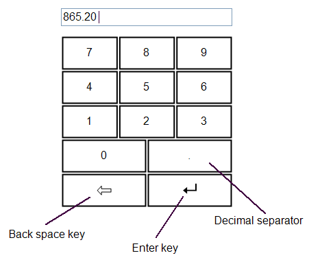
The default numerical key pad, with back space and enter key, in use with an Input Field
The Key Pad functions by typing with your fingers on a touch monitor, as well as by pressing the mouse cursor on the keys.
Layout of the Key Pad
The Key Pad automatically layouts its keys per row. Each row of keys may have its own number of keys. In one row, all keys have the same size. Vertically, every row has the same height.If you resize the Key Pad component, the keys are automatically resized and stretched to fit the entire area of the component.
How to create your own key pad
The Key Pad properties dialog does not offer to make custom key pad layouts. Still, it is possible to create your own key pad, using a simple text editor like Notepad.In order to make a custom key layout, start by adding a default Key Pad from the Toolbox to your project. Then copy the key pad and paste in the text editor.
You will see that the copied key pad has been transformed into human readable XML code. You can change that code and then copy the code back onto the page in your Polybench project, where the key pad will be displayed as component again.
Please note that in some text editors, the first copied character of the XML code is a control code, which may be displayed as '?'. If you copy back the XML text into Polybench, do not select that first character, otherwise nothing will be pasted in Polybench.
The structure of the XML code that describes the key layout is easy to understand: within the element KeyMatrix there are rows of keys within ArrayOfString elements. Each key is embedded in a string element. You may add or remove as many rows of keys, or individual keys as necessary. Spaces outside of the element tags are ignored.
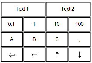
One key does not necessarily have to contain only one character. You may also put a longer text in one key! So, it is possible to define text input with standard texts, where the user only needs to press one key. For example, the following key pad could be created:
Key pads may contain standard control keys. Those are described with the following pre-defined codes:
{SHIFT} - Presses the Shift key for the next character
{BACKSPACE} - Presses the Backspace key
{ENTER} - Presses the Enter key
{ESC} - Presses the Escape key
{LEFT} - Presses the Left arrow key
{RIGHT} - Presses the Right arrow key
{UP} - Presses the Up arrow key
{DOWN} - Presses the Down arrow key