 Input Field
Overview
The Input Field can be used to let the end-user enter text in an application. The text that is entered is stored in a Variable of the Input Field, and can be read by other objects in the application. Also, the entered value can be put out using an Action.The Input Field is either single line, or allows the end-user to enter multiple lines.
Properties
Find more information about changing properties here: linkAction
type: Select from the listSelect the code of the Action that is performed when you press enter of when you leave the input field.
Select one of those presets:
The default Action is 'None', which means that no action is performed when you enter text in the input field.
If you select the action SET_PARAMETER and a valid Address, then the text or value of that address will be displayed in the input field.
If you select the action SET_PARAMETER and a valid Address, then the text or value of that address will be displayed in the input field.
Value
type: See description [this value cannot be changed]The value to set at the Address is determined automatically
Address
type: Address, starts with '$' sign (see link)Fill in the address of the object that should receive the Action.
You may type or paste the address, or you may press the small button on the right to open the Address Searcher dialog (link)
MultipleLines
type: True or FalseSet to True if the input field should display more than one line.
Select one of those presets:
True or False
True may also be read like 'yes' and false like 'no'
True or False
True may also be read like 'yes' and false like 'no'
TextLength
type: Integer valuethe maximal length of the input text. The length is not checked if this value is set to -1.
ReadOnly
type: True or FalseSet to True if the input field should not allow textual input.
Select one of those presets:
True or False
True may also be read like 'yes' and false like 'no'
True or False
True may also be read like 'yes' and false like 'no'
Per default the Input Field is not for reading only, because its main purpose is to provide textual input. However, the Input Field can also be used to just display text and in that case ReadOnly property should be True.
SelectOnFocus
type: True or FalseSet to True if the input field should select its contents if the user gives it the focus for the first time.
Select one of those presets:
True or False
True may also be read like 'yes' and false like 'no'
True or False
True may also be read like 'yes' and false like 'no'
BackgroundColor
type: Known color nameThe background color of the text box
This property uses the Color Repository. For more information about the use of colors in a project, refer to link
TextColor
type: Known color nameThe text color
This property uses the Color Repository. For more information about the use of colors in a project, refer to link
BlinkColor
type: Known color nameThe alternate color of the background if the input field is in blinking mode.
This property uses the Color Repository. For more information about the use of colors in a project, refer to link
Font
type: Known text font nameThe font of the text
This property uses the Font Repository. For more information about the use of text fonts in a project, refer to link
Size
type: Size containing width and heightThe size of the user interface of this object (width, height).
Coordinates
type: CoordinateThe location of the user interface of this object in (x,y) coordinates, relative to the object it is on top of.
Caption
type: Word or phraseThe name of the object in the project. This name must not contain '.' or '$' characters.
Every object has the Caption property. This property is very important, because it is the name by which Polybench recognizes this object.
It is allowed to give multiple objects the same name, as long as the objects are of the same type. In that case, a reference to this caption includes all the objects with the same caption.
In Polybench, every object can be addressed by an Address specifier, which starts with the dollar sign, for example: $My Page.My Object. 'My Page' would be the Caption of a page, and 'My Object' the Caption of an object on that page.
Documentation
type: See descriptionOptional documentation of this object.
It is good practice to write in short notes why you have used this object, and why its properties are set the way they are set. If this object is an operator, the Documentation text is displayed below the operator symbol.
Variable Parameters
Find more information about Variable Parameters here: linkAddress
type: See descriptionThe address of the variable that is linked to the input field, using the specified Action.
Please note that if you are using SET_PARAMETER in another object to change this address, that in the other object's Value property you need to use a double '$' sign to copy the address. Otherwise you would copy the contents of the address, in stead of the address itself.
Text
type: See descriptionThe text that is currently displayed in the input field
Functions
Find more information about Functions here: linkBlink
Starts blinking the input field background, using the BlinkColorBlinkOff
Lets blinking the input field background stopEnable
Sets the input field to Enabled, so that it accepts user input.Disable
Sets the input field to Disabled, so that it does not accept any user input.
Details
The Input Field can be used either passively or actively. In passive mode, no Action is selected (Action is 'None'). If the user types text into the box, then nothing happens. Other components in your project may read the text, but the Input Field doesn't care about that.In active mode, an Action has been specified. You may select any available Action, but in most cases you would probably select SET_PARAMETER. With SET_PARAMETER you can change a text or value in another component in your project. If you use this feature, then after typing text and either pressing Enter, or leaving the Input Field, the new text is copied to the specified address (see Address property). Also, in this case the text or value of that address is always displayed in the Input Field.
In some cases it is useful that the text inside the Input Field is selected as soon as the end-user clicks on it for the first time. The end-user can then delete the contents by starting to type. To enable this feature, the SelectOnFocus property should be set to True (default True).
To draw the attention of the end-user, you may call the Blink function, using a FUNCTION action. After calling the Blink function, the Input Field starts blinking, using the Blink Color, until the end-user clicks on the Input Field.
If a general RESET action is called, then the contents of the Input Field are removed. This only happens if the Input Field is in passive mode.
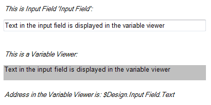
One application to demonstrate the behavior of the Input Field, is to add an Input Field to a project, and also a Variable Viewer (link). Let the Address of the Variable Viewer point to the address of the 'Text' variable of the Input Field. If you now type text in the Input Field, the text will be copied to the Variable Viewer immediately, as shown in the following figure:
If the Input Field is placed on a Printable Page, it will not be printed on paper.