 List Viewer
Overview
Use this object to view and edit the contents of list variables. List variables are offered by some objects in their Variable Parameters.If you open the drop down list of available addresses, the addresses that contain list variables are shown.
Properties
Find more information about changing properties here: linkAddress
type: Address, starts with '$' sign (see link)The Address of the variable list that should be displayed in the viewer.
You may type or paste the address, or you may press the small button on the right to open the Address Searcher dialog (link)
BackgroundColor
type: Known color nameThe background color of the list. (Semi-)transparent colors are supported by the List Viewer.
This property uses the Color Repository. For more information about the use of colors in a project, refer to link
ForegroundColor
type: Known color nameThe text color
This property uses the Color Repository. For more information about the use of colors in a project, refer to link
GridColor
type: Known color nameThe color of the items grid. Set to the background color or transparent to hide the grid.
This property uses the Color Repository. For more information about the use of colors in a project, refer to link
HighLightColor
type: Known color nameThe color that is used to high-light the a list item.
This property uses the Color Repository. For more information about the use of colors in a project, refer to link
Font
type: Known text font nameThe font of the text
This property uses the Font Repository. For more information about the use of text fonts in a project, refer to link
BorderStyle
type: See descriptionSelect a border style from the drop-down box.
AllowDrop
type: True or FalseIf set to True, the end-user can drag text on the list viewer to change the content of a list item. Depending on the list that is displayed, the dragged text is accepted. If set to false, nothing can be dragged onto the list viewer.
Select one of those presets:
True or False
True may also be read like 'yes' and false like 'no'
True or False
True may also be read like 'yes' and false like 'no'
AllowMouseScrolling
type: True or FalseSet to True to allow the list to be scrolled by using the mouse wheel.
Select one of those presets:
True or False
True may also be read like 'yes' and false like 'no'
True or False
True may also be read like 'yes' and false like 'no'
Enabled
type: True or FalseIf set to False, the end-user cannot edit any of the items in the list viewer, or drop text on it.
Select one of those presets:
True or False
True may also be read like 'yes' and false like 'no'
True or False
True may also be read like 'yes' and false like 'no'
IndexOffset
type: Integer valueOffset of items to be displayed. For example, if the offset is 10, then the first shown item is the 11th item in the list. Default is an IndexOffset of 0.
MaxItems
type: Integer valueMaximum number of items that is displayed in the list. If this value is 0, then all items are displayed.
Size
type: Size containing width and heightThe size of the user interface of this object (width, height).
Coordinates
type: CoordinateThe location of the user interface of this object in (x,y) coordinates, relative to the object it is on top of.
Caption
type: Word or phraseThe name of the object in the project. This name must not contain '.' or '$' characters.
Every object has the Caption property. This property is very important, because it is the name by which Polybench recognizes this object.
It is allowed to give multiple objects the same name, as long as the objects are of the same type. In that case, a reference to this caption includes all the objects with the same caption.
In Polybench, every object can be addressed by an Address specifier, which starts with the dollar sign, for example: $My Page.My Object. 'My Page' would be the Caption of a page, and 'My Object' the Caption of an object on that page.
Documentation
type: See descriptionOptional documentation of this object.
It is good practice to write in short notes why you have used this object, and why its properties are set the way they are set. If this object is an operator, the Documentation text is displayed below the operator symbol.
Variable Parameters
Find more information about Variable Parameters here: linkIndexOffset
type: See descriptionOffset of items to be displayed. For example, if the offset is 10, then the first shown item is the 11th item in the list. Default is an IndexOffset of 0.
MaxItems
type: See descriptionMaximum number of items that is displayed in the list. If this value is 0, then all items are displayed.
CurrentIndex
type: See descriptionRepresents the index of the first item that is currently shown in the List Viewer. The very first item of a list has the index 0. If IndexOffset is not 0, then then CurrentIndex is offset by this value.
Functions
Find more information about Functions here: linkScrollUp
Scroll the list viewer so that you can see items above the item at the top of the list. In other words, you are then shifting your view to more towards the top of the list.Parameter:
Specify the number of items to scroll in one call. If nothing is specified, one item is assumed automatically.
Specify the number of items to scroll in one call. If nothing is specified, one item is assumed automatically.
ScrollDown
Scroll the list viewer so that you can see items below the item at the bottom of the list. In other words, you are then shifting your view to more towards the bottom of the list.Parameter:
Specify the number of items to scroll in one call. If nothing is specified, one item is assumed automatically.
Specify the number of items to scroll in one call. If nothing is specified, one item is assumed automatically.
ScrollTop
Scroll the list viewer to the top of the list.ScrollBottom
Scroll the list viewer to the bottom of the list.
Details
Polybench uses two major types of variables: single value variables and list variables. Single values can be viewed by the Variable Viewer (link), whereas lists can be viewer by the List Viewer.The List Viewer is a very special component, that is able to display lists with values of all kinds. How a list is displayed is only partly determined by the List Viewer; the object that provides the list determines the rest.
For example, it is the component that provides the list, that determines if the list can be edited at all, and if the items can be edited, then how that exactly works.
The List Viewer itself provides some properties and functions to determine how many items are displayed at once, and whether the items can be scrolled.
Showing very long lists
If you require to display a long list that does not properly fit into one List Viewer (because the items get so compressed that they are not readible anymore), then there are two options to spread the data:1) Either make the list scrollable, or
2) Divide the list and display it in multiple List Viewers
For option 1 you may use the ScrollUp, ScrollDown, ScrollTop, and ScrollBottom functions of the List Viewer. Also, if you set the property AllowMouseScrolling to True, the user can scroll the list using the mouse wheel.
The first option, a scrollable list of items, is used by most other software, but it has disadvantages. It is not always suitable for touch screens, because not all touch screens are sensitive enough for a scroll movement of the finger. Also, a scrollable list hides a part of the data, so that the user never has a full overview of all the items.
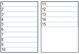
Therefore, Polybench offers the unique option to divide a list and show it in multiple List Viewers. The set-up of a multi-list is simple: just define how many items are visible in one viewer (MaxItems property), and specify the index of the first item to show (IndexOffset property).
For example, you have a list of 15 items, but the height of a list allows for only 10 items to be shown at once.
Now, add two List Viewers and set the MaxItems of both to 10. The first List Viewer gets an IndexOffset of 0 (because it should show the data from the first item onwards), and the second List Viewer gets an IndexOffset of 10. The next image shows how the data will then be displayed:
Interestingly, the scroll functions ScrollUp, ScrollDown, ScrollTop, and ScrollBottom now still work; even for lists that have been broken up in different List Viewers. To use that feature, all List Viewers that together show one list, should be placed on the same surface, and must have the same Caption.
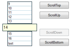
One list, divided over three List Viewers. The Action Buttons (link) are set-up for the actions FUNCTION with the four scroll functions of the List Viewer. All three List Viewers are placed on the same surface, and use the same Caption.